The Rise of Flat Icons in Modern Web Design
Web designing is evolving day by day. The style and functionality go hand in hand. One design trend that has become popular during the last couple of years is flat design, or rather, an approach that keeps things simple and usable. Of all the elements of a modern flat design, the most important one proves to be flat icons, which have altered the aesthetics as well as the functionality of websites.
Flat icons are part of the language of modern web design. It’s about being aesthetically pleasing while also serving functionality. In this guest post, we’re going to take a look at how flat icons emerged, why they are so trendy, and what changes they’re bringing into the web design scene. Finally, we will explore how you can implement them in order to improve your website and talk about IconFair, the high-quality platform for providing high-quality flat icons to help web designers make intuitive and visually attractive websites.
What Are Flat Icons?
To understand why flat icons have become so popular, it’s first important to understand what flat icons are.
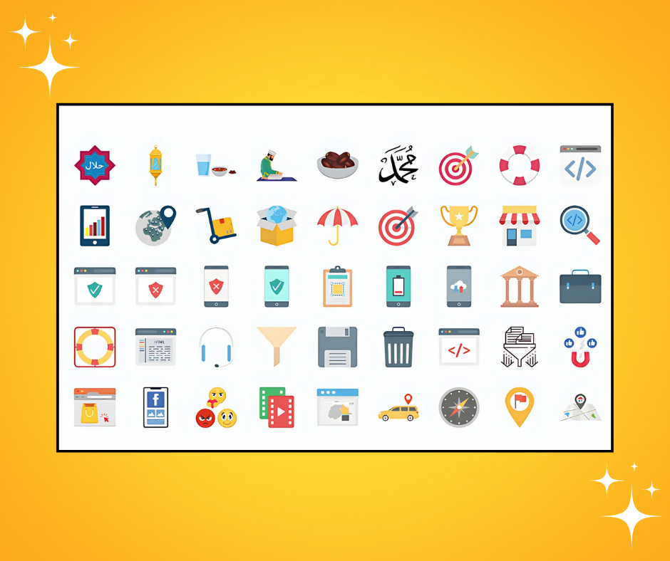
Flat icons are two-dimensional, meaning they lack intricate details, textures, gradients, and shadows. Instead, they rely on simplicity by using solid colors and clear shapes. Flat design originated as a reaction to skeuomorphic design, which was detailed in textures and shadows to mimic real-life objects, and has since become the design standard for many digital products.
Minimalist Style: Flat icons are clean and simple, devoid of unnecessary embellishments.
Bold Colors: They tend to use bright, solid colors that pop out and enhance visual recognition.
Simple Shapes: Flat icons are made of geometric shapes like circles, squares, and lines, which can be easily identified at small sizes.
Web interfaces, mobile applications, and even branding elements make wide use of flat icons, creating sleek, modern, and user-friendly designs.
Why Flat Icons Are Becoming So Popular
In the recent years, flat icons have been extremely popular as they improve user experience without looking old-fashioned and clumsy. The following are the reasons why flat icons have become so popular in modern web design:
- Simplicity and Clarity
Simplicity is the most important principle of flat design. The elimination of shadows, gradients, and textures keeps visualization light, making the content easy to read. Large solid colors and simple forms help icons with bold colors easily be understood by users at their small size.
Enhanced User Comprehension: The simplicity of flat icons allows users to immediately understand the purpose of an icon, such as the home icon, search icon, etc., thereby improving navigation efficiency.
Clean User Interface: Flat icons assist in creating a clean user interface (UI), thereby reducing unnecessary distractions that could overwhelm users.
By choosing flat icons for your website or app, you’re embracing a style that focuses on clarity and user understanding something crucial in today’s fast-paced digital world.
- Better Mobile Experience
With the majority of internet traffic coming from mobile devices, it is important for web designers to focus on mobile-friendly designs. Flat icons are ideal for mobile devices because they are simple, lightweight, and scalable. Their clarity ensures that users can interact with them quickly and efficiently, even on smaller screens.
SVG: Flat icons are usually designed in SVG (Scalable Vector Graphics), which allows them to scale to any screen size without a loss of quality. This is particularly important in a mobile-first world, where designs need to be responsive to various screen sizes.
Fast Load Times: Flat icons are lightweight and do not require large image files or complicated textures, which helps your website or app load quickly.
As flat icons result in quicker loads and have flexible scaling on mobile devices, they are an ideal fit for responsive web design, thus becoming a significant aspect of modern web interfaces.
- Improved Visual Classiness
Flat icons are attractive in their minimalism. They are bold and clear, making them more vibrant with bright colors, so the user is forced to look at the website in order to know what is essential to him/her. Their minimalism makes them a perfect fit into modern web design, creating an organized and beautiful structure.
Uniform Branding:Flat icons are easily adaptable to the color palette and brand identity of your website or product to further your visual identity.
Interactive Feel:A clean design through the use of flat icons provokes interaction. A user will feel more interactive in a simple and clean design, where content and usability dominate the focus.
Due to their aesthetic appeal and functionality, flat icons are adding a modern, clean, and professional touch to the design language that will appeal to the user and reinforce the brand.
How Flat Icons Are Revolutionizing the World of Web Design
Flat icons are more than just a passing trend — they are revolutionizing web design by changing how websites are structured, navigated, and interacted with. Let’s take a look at some of the ways flat icons are shaping the future of web design:
- Streamlining Website Navigation
The very nature of successful website design is supported by proper navigation. A key element improving navigation experience lies in flat icons. This means that flat icons can replace text in a menu, so it makes the layout cleaner and reduces visual clutter. For instance, a very simple hamburger icon three horizontal lines have now become very widely recognized as a form of navigation menu.
Simpler Action Buttons: Flat icons are well suited to the expression of action-based activities, such as search, share, like, or shopping. In such a manner, they will provide clear intent regarding the actions users can make upon them when engaging.
Easier Navigation: Flat icons are clearly differentiated and speak in a similar language. In that regard, they are conducive to easier navigation for everyone involved.
Using flat icons in your website’s navigation will create an intuitive and user-friendly experience that reduces the time it takes for users to find what they are looking for.
- Promoting Design Consistency
One of the advantages of flat design is that it is consistent across multiple platforms and devices. Flat icons are intrinsically versatile and can be used across websites, mobile apps, and desktop applications without feeling out of place. This consistency is essential for creating a unified experience for users, regardless of where they encounter your product.
Integrated Design:Flat icons help to bring unity in the design across all parts of your website or application.
Brand Consistency: Custom-designed flat icons can further be aligned to a branding system that will run consistent with your brand guidelines.
Using flat icons on your website and other digital assets is part of building a uniform design system that will enhance the consistency of your brand and promote a better understanding of your brand by its user interface.
How to Implement Flat Icons in Web Design
Adding flat icons to your website requires some thought and planning. Here are some best practices for effectively using flat icons in modern web design:
- Choose Icons That Represent Your Brand
When selecting flat icons, it’s crucial to pick ones that align with your brand’s identity. Custom-designed flat icons can help strengthen your brand image and create a cohesive look across all platforms.
Color Palette: Choose flat icons that match your website’s color scheme to maintain visual consistency.
Icon Style: Stick to a consistent style of flat icons (e.g., outline icons, filled icons, etc.) to ensure visual harmony.
If you are looking for premium quality custom icons that will reflect your brand personality well, IconFair offers the best flat icons suited to your requirements.
- Scalable
Scalability is the greatest attribute of flat icons. Always go for vector-based icons (in formats like SVG or AI) that will render sharp on a screen of any size, whether it’s the smallest mobile or the largest desktop monitor.
- Use Icons for Key Actions
Most effective icons are used when they describe common, easy-to-understand actions. Display flat icons prominently on your site to direct visitors to key activities such as navigating, shopping, or sharing.
Conclusion: Why Flat Icons Are Here to Stay
The rise of flat icons in web design is a revolution that has reshaped the look and functionality of sites. Minimalistic style, scalability, and facilitation of usability are some strengths through which websites by the modern web designer can be more richly powered.
If you want to improve the navigation of your website, reduce visual clutter, and create a modern aesthetic, then using flat icons is an effective way to do so. Whether you are building a brand-new website or refreshing an existing design, integrating high-quality flat icons is a surefire way to make your website more visually appealing and user-friendly.
Need high-quality flat icons to spice up your web design? Check out IconFair for a collection of customizable flat icons designed to make your website look better.